Last Updated May 23, 2011 07:59 PM PDT
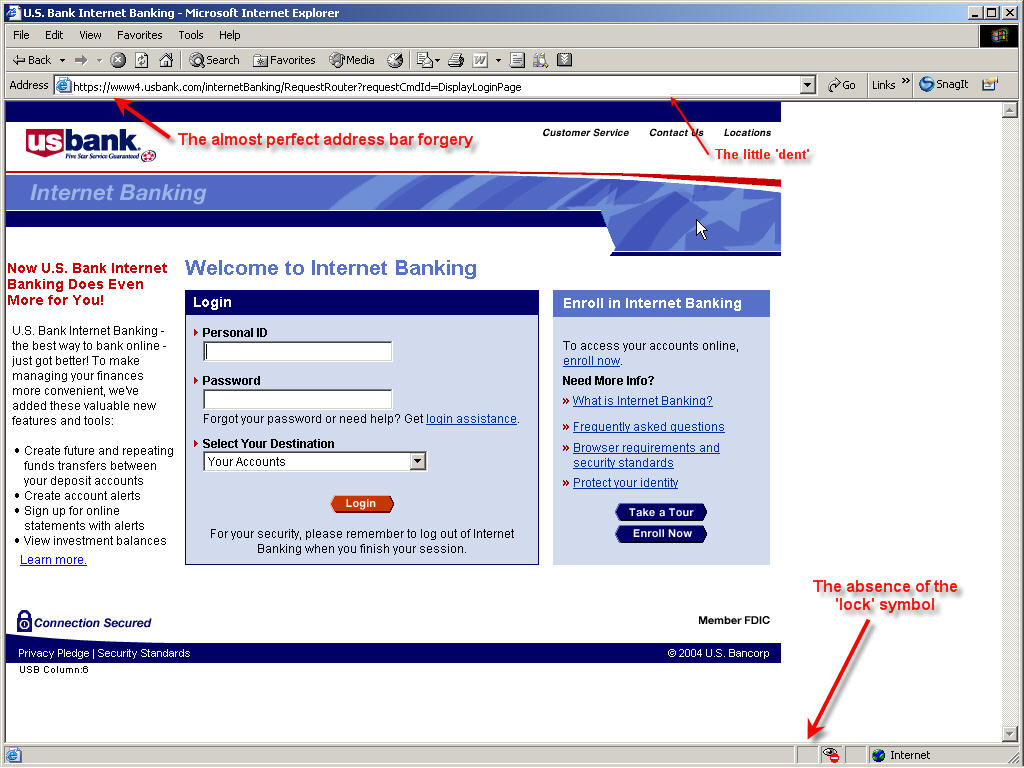
Just so you can see how realistic a phishing page can be, we took one of the pages from the Anti-Phishing Organization. This one is quite clever in it's design. Here's the first page you will be taken to if you were to click on the phishing link. This is just a graphic image of the site. You would have to look really close to see the address bar overwrite. (Note that the address bar overwrite technique will be much harder to do if you apply the Windows XP Service Pack 2.)
Although this example shows a US Bank phishing attempt, please be aware that any bank can be (and has been) targeted with similar phishing attempts. The Anti-Phishing Organization has details on many such attempts in their Phishing Archive.

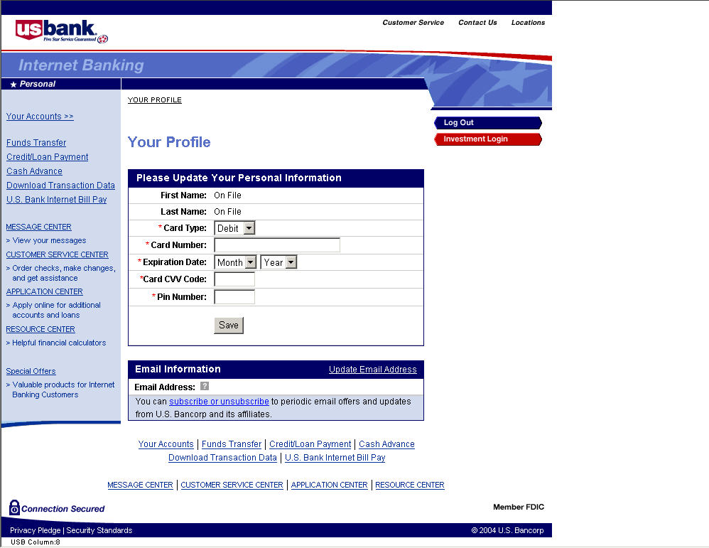
Note that the page is quite believable in design and implementation. Once you log in, you get this page. All you have to do is enter the requested information, and then sit back and wait for the bogus charges on your checking account.

You can see the full analysis of this particular phish at their web site, along with lots of other examples.
The rule still applies: you should be very careful with email messages that ask you to verify your personal / financial / login information. If you need to do that, go to the real web site by typing in their web site address, never by clicking on a link in the email.
Caveat Emptor!
Rick Hellewell -- August 12th, 2004
More comments available on our "Daynote" site: http://www.digitalchoke.com/daynotes. Your are invited to send your comments here.